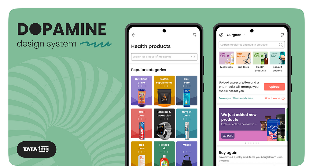
Dopamine — Tata 1mg’s design system
As Tata 1mg grew the consumer product — so did the demand to create, expand, and refine UI screens, growing at an unprecedented rate. With the expansion of the product, inconsistencies in the user experience emerged, spurred by different teams working on various products, necessitating a shared understanding of the user journey.Thus, emerged the need to realign design resources, shifting the focus from fine-tuning UI elements to tackling more intricate challenges. A unified language for designs was imperative, promoting visual consistency across cross-functional teams and products alike.In 2020, we introduced our design system for our consumer app, Dopamine. It aimed to create a common understanding of experience and to create visual consistency.
How did we get to Dopamine?
The name draws inspiration from the neurotransmitter, a key player in our distinctive human ability to think and plan, enabling us to strive, focus, and find things intriguing.
Pre 2019, Tata 1mg tackled inconsistencies in the experience with style sheets, weekly check-ins, inter team monthly syncs. These interventions had varied levels of success but weren’t scalable. We also went through a re-branding phase which showed us the cracks in our current ways of tackling inconsistencies.
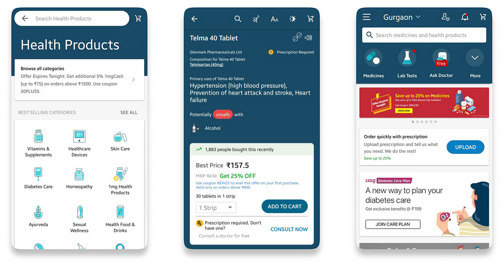 Tata 1mg app before the re-branding phase (Pre 2019)
In 2019, the entire product and engineering team prioritized the creation of a scalable design system. Influenced by the atomic design methodology, we tailored it to our unique needs, incorporating new brand guidelines.Months later, we implemented the system on our consumer app, giving birth to Dopamine in early 2020.
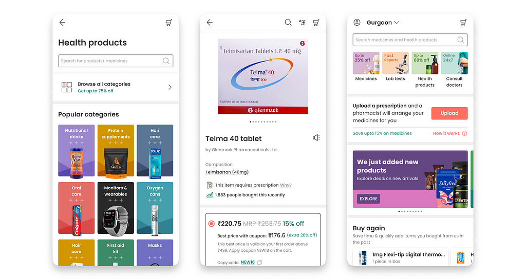 Tata 1mg app after dopamine implementation (2020) | Mockup
Introducing Dopamine
Dopamine is our in-house design system crafted for consumer apps, offering cross-functional teams nearly everything they need for scalable and consistent experiences.

The system is maintained by a federated model. Designers from different teams periodically contribute to the system, ensuring continuous evolution.Dopamine has a foundational layer left undisturbed until a refresh aligns with our brand guidelines. Furthermore, a flexible layer allows for periodic updates.
Design principles behind Dopamine
More than just a style guide, Dopamine is about delivering a consistent user experience and infusing the brand’s archetype into designs.We have 3 principles that stay consistent, and that are tweaked only when there is a shift in design’s core values.
- Minimal, not ostentatiousWe want to highlight the information being sought, above everything else, with the least frills possible.
- Caring friend, not a preacherWe want to objectively educate the user about the benefits of something on our app, before explaining how it is the appropriate solution for them.
- Empowering with information, not instructionsWe want to understand the consumer’s apprehensions and concerns at every step of any task and address them with conviction, helping them to make a more informed decision.
Beyond these principles, Dopamine embodies user-centricity, consistency, and simplicity.
The sum of the parts
The total effectiveness of Dopamine is greater as a whole than the effectiveness of the parts when acting in isolation. The parts or structure of our design system work in symphony with each other to increase the scalability of our UIs.
Foundation (style elements)
Style Elements are the principal units of Dopamine. It creates the environment for the entire component and widget ecosystem.
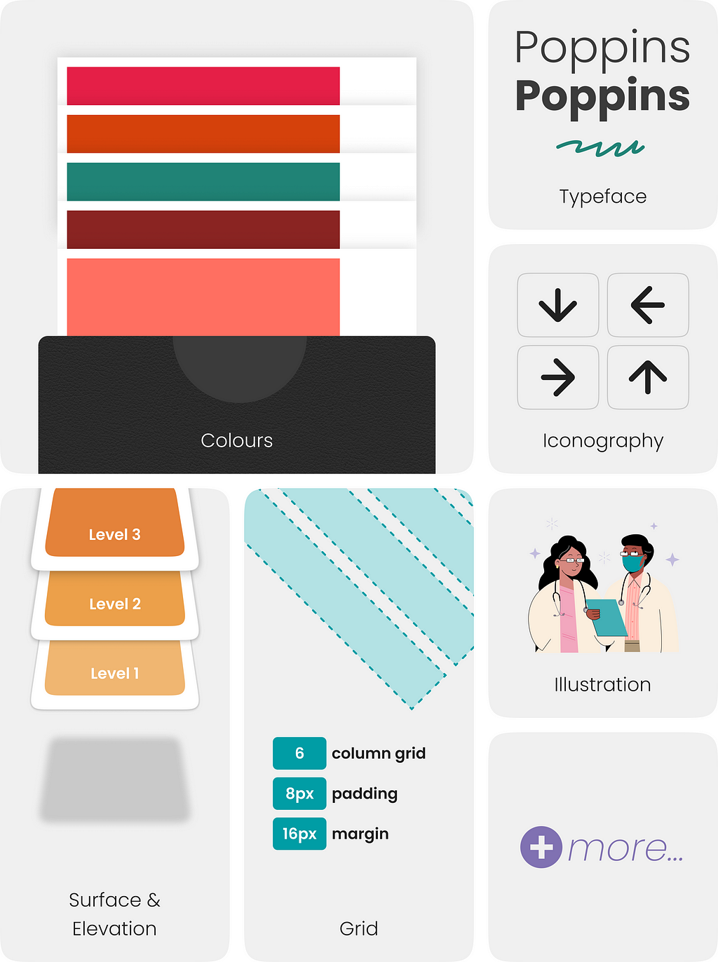
Components
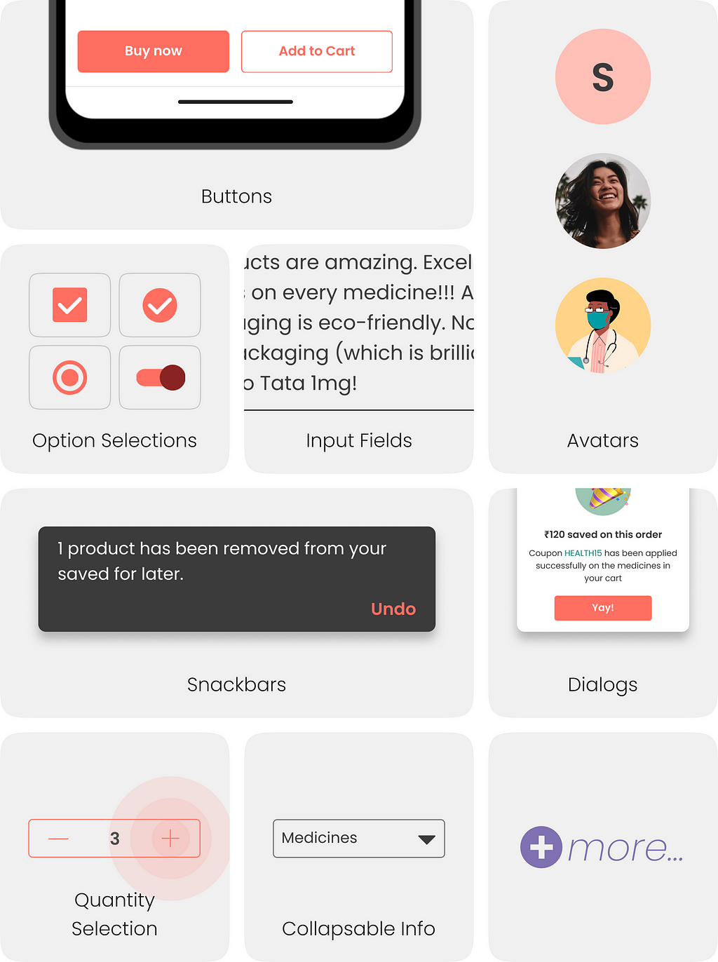
Components are created by combining the style elements and adhering to design guidelines. It is a union of style elements and their guidelines to create an element that has a unitary function.
Widgets
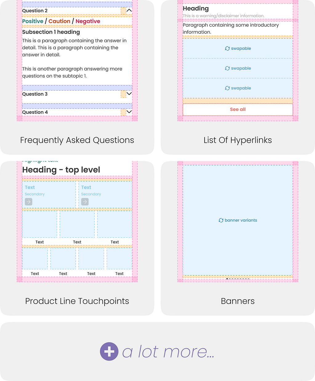
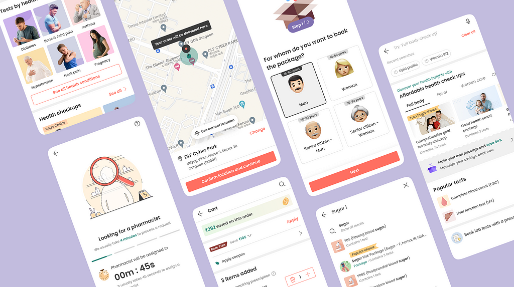
Widgets are a meaningful arrangement of one or more user interface components, which serve a particular business function, and stay the same, irrespective of the use case.In simpler terms, all sections or pages for our UIs are handed over as widgets. Whenever widgets can be reused based on their function, they are reused.
Looking back and looking ahead…
Almost 3 years in, we have seen the design system grow in directions that we didn’t anticipate. Dopamine has continuously helped in many aspects above and beyond what was expected from the design system. However, we do acknowledge some of its limitations and plan to counteract the limitations.The federated model of maintaining Dopamine has worked well. We are also observing that now we are leaning away from a federated model to a solitary model, which may not be the best way to evolve the system.Next up for Dopamine is…..

With Dopamine 2.0, We will converge the system, add a few details and rework some aspects to make the system meet newer needs.
Dopamine — Tata 1mg’s design system was originally published in Tata 1mg Technology on Medium, where people are continuing the conversation by highlighting and responding to this story.
- Log in to post comments
- 5 views
